The Frutiger Aero timeline: the optimistic future that almost was
Glossy glass, water droplets, blue skies and friendly technology. Frutiger Aero was the look of a hopeful future from about 2005 to 2013. Here is the timeline, where the name comes from, why it faded, and why it is back.
In this story
For about eight years, technology was meant to look like a clear blue sky: glossy, transparent, friendly and close to nature. That look now has a name, Frutiger Aero, and a lot of people miss it. I think it is worth asking what future it was promising, and how much of that promise is still on the table.
This is the design language I use on this site, on purpose. I grew up in it, and I still think it got something right. This post tells the story, keeps the facts checked, and then tells you what I make of it.
Where the name comes from
Nobody called it Frutiger Aero at the time. The name was made up afterwards, by people looking back. The Consumer Aesthetics Research Institute (CARI), an online archive of design styles, credits it to Sofi Xian, with Froyo Tam, and describes it as the corporate tech aesthetic popular from about 2005 through 2013. It is a compound of two things: "Aero", the glassy interface design that Microsoft introduced with Windows Vista, and "Frutiger", the typeface by the Swiss designer Adrian Frutiger that inspired Vista's default interface font. You can read the archive's own page on Frutiger Aero and the Wikipedia summary. Accounts differ slightly on whether the term dates to 2017 or 2018, so I will just say it is recent.
A rough timeline
I have stuck to dates that the sources agree on, and rounded where they do not.
- Mid-2000s: the look forms. Glassy buttons, gradients, soft shadows and wallpapers of blue sky, grass and water appear across software, websites and adverts.
- 2006: Windows Vista and the Nintendo Wii Sports era. Vista brought the transparent "Aero" glass to millions of desktops. The Wii, with its friendly, white, rounded design, arrived the same year.
- 2007: the first iPhone. Glossy, three-dimensional icons that looked like real objects (skeuomorphism) became the standard on phones.
- 2009: Windows 7. Often remembered as the peak of the style on the desktop.
- Around 2012 to 2013: the shift. Windows 8 introduced a flat, tile-based look, sometimes called "Frutiger Metro" as a transition, and by the early 2010s flat design had largely replaced glossy realism.
- 2023 to 2024: the return. The look resurfaced as a nostalgic internet aesthetic, especially among younger people on YouTube and TikTok.
What the look was made of
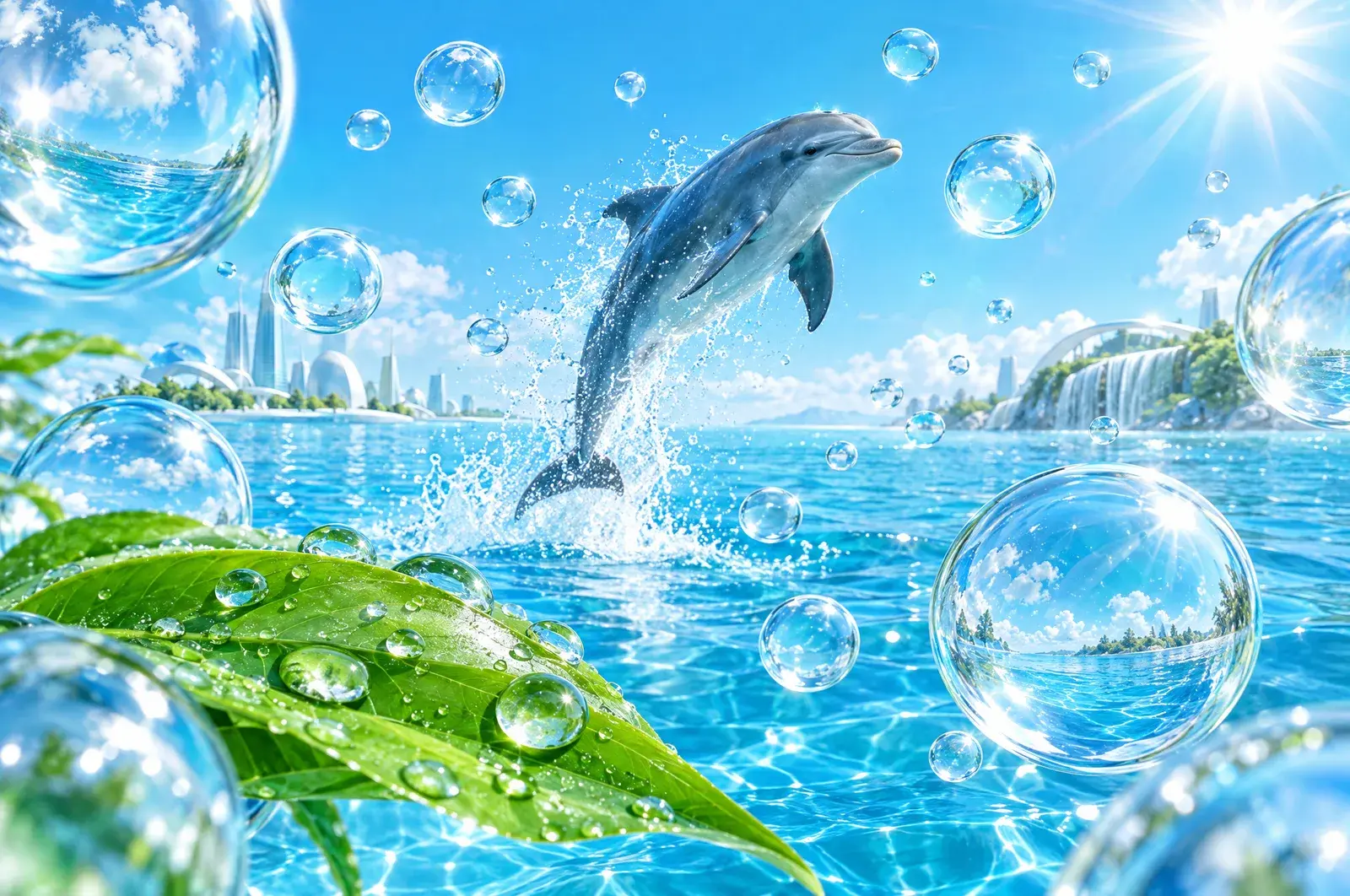
The visual ingredients were consistent: blue skies, fresh grass, water, bubbles, lens flares, bokeh and aurora photographs, plus tropical fish and dolphins (video games such as Ecco the Dolphin are named as an influence). Interfaces looked like glass and polished plastic, with a light that seemed to come from above.
Two ideas sat underneath. The first was that technology could be friendly, warm and a bit playful. The second was that technology and nature were not opposites. A computer could look like a droplet of water, and a phone could look like a piece of the sky.
Why it faded
The sources say it was replaced by flat design in the early 2010s. Beyond that, the reasons are more opinion than fact, and I want to mark this section clearly as my own view.
- Practical reasons. Flat interfaces are lighter to run, easier to scale across different screen sizes, and cheaper to design. That matters when everyone is moving to phones and tablets.
- Fashion. Every style eventually looks dated, and flat design looked clean and adult by contrast.
- A change of mood. Around the same time, the general feeling about technology shifted. Social platforms grew, attention became the product, and the friendly-gadget tone started to feel naive.
That last point is speculation, and I would not push it further than that.
What the picture promised
If you take the look at face value, it promised something specific: a world where technology was clean, gentle, sunlit and integrated with nature, in which the future was a pleasant place to be. It is the same promise that solarpunk makes, in a different visual dialect. Both say: what if the future looked like a place you would want to live?
Which parts came true
This is the part I find hopeful, and I will try to be fair about it.
- Clean energy at scale. The picture of technology in harmony with the sun has become measurably true in one area. Solar is now the cheapest new electricity in many places, and in 2025 renewables overtook coal for the first time in a century.
- Home energy in ordinary hands. Small solar kits are now legal in the UK.
- Cities designed around people. Real examples exist, described in solarpunk cities that already exist.
- Friendly, useful gadgets. Some do exist, though many are now tied to advertising and subscriptions.
Which parts did not
- Calm technology. For most of us the phones that arrived were the opposite of calm. They compete for attention, which I discuss in doomscrolling, attention and what to build instead.
- Nature in the picture. The pictures showed green and water everywhere. Most of our screens show us pale grey rectangles.
- Technology we own. Many devices now depend on accounts and cloud services in a way the friendly-gadget era did not promise.
Why I use it here
Two reasons. One is emotional: the look makes me feel calm and hopeful, and I would like this site to be a place where a fast mind can breathe. The other is a working principle. Bright, open, water-and-sky imagery is a good visual match for the sound sessions and for the idea that you can put down a heavy load for a few minutes.
I am also aware that nostalgia can be a trap. The point is not to go back to 2008. It is to take the good idea out of it, that technology can be warm and gentle and connected to the natural world, and to build it properly this time.
What to steal from it
If you make things, whether it is a site, a room or a routine, here are some ideas from the style that are worth keeping:
- Light. Let plenty in.
- Clear, honest materials. Glass, water, wood, plants.
- Warmth over sharpness. Rounded corners, soft transitions.
- Nature in the frame. A plant, a view, a sky.
- A tone of quiet optimism. Not naive, just willing.
Come and look at the future with us
If you have a favourite memory of that era, or a picture of the future you would like to see built, the ADHD MindFlow community is a good place to share it. And if you want to hear what this look sounds like, try the listening previews. They are meant to feel a bit like standing in that sunlight.
A personal view. Facts about the term and its timeline are from the CARI archive and Wikipedia, linked above. The reasons for the style's decline are my own opinion.
Personal view, with sources linked so you can check the numbers yourself. Read our sources, commercial disclosure and editorial approach.
Follow your curiosity.
 The future
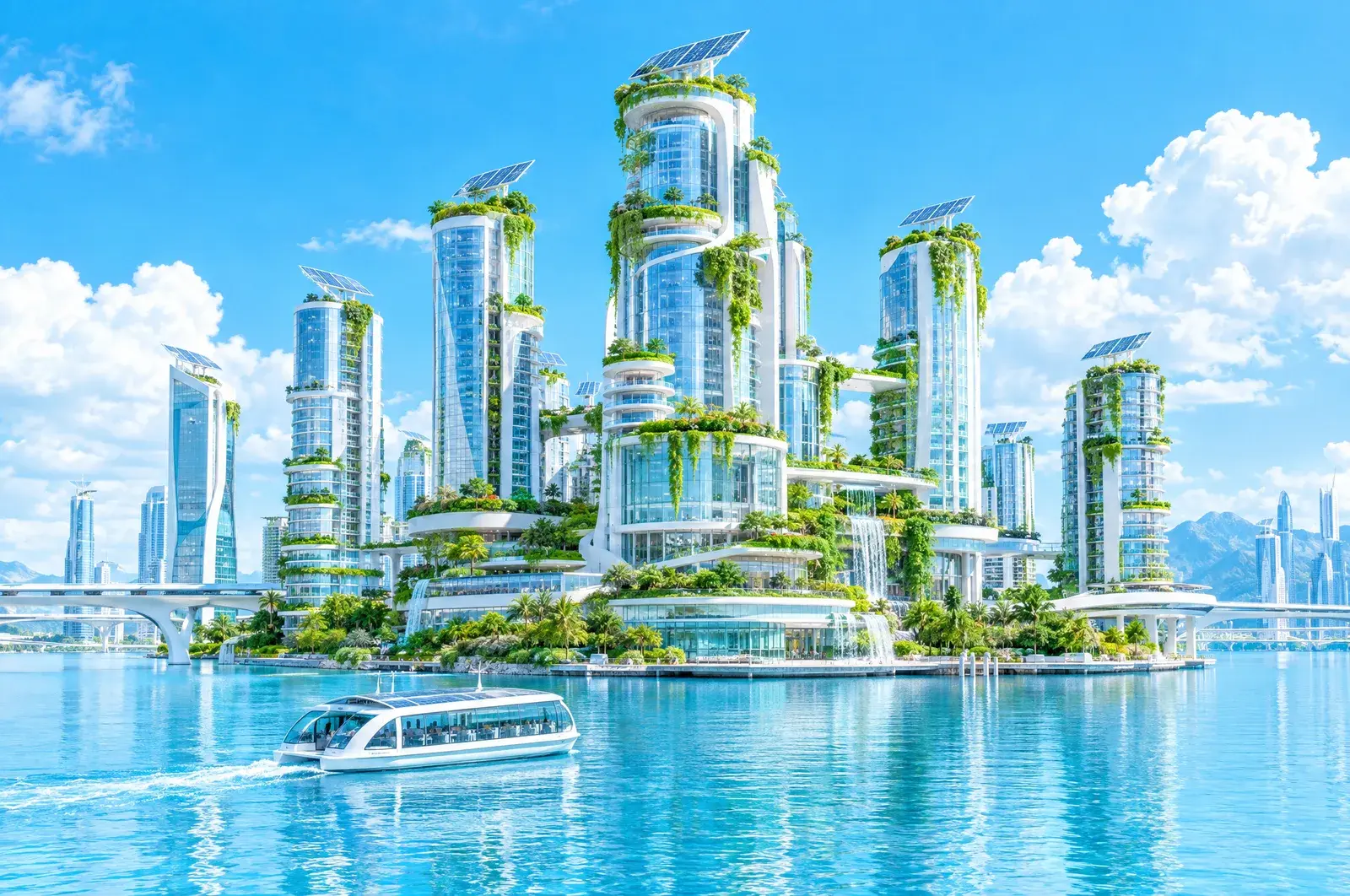
What is solarpunk? The optimistic future, and what is already real
Solarpunk imagines a future where clean energy, nature and community fit together. It began as a 2008 blog post and became an art, fiction and design movement. Here is what it means, what is already real, and where it falls short.
5 min read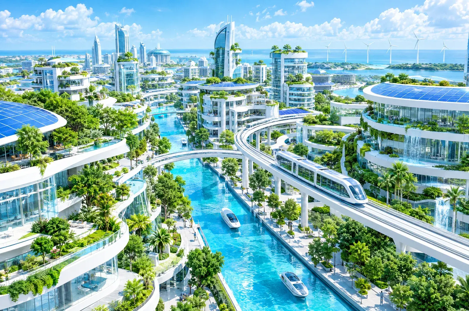 The future
Solarpunk cities that already exist: Vauban, Copenhagen, Medellín and Curitiba
You do not need to wait for the future to see cities that work differently. Four real places, what they actually did, the numbers reported, and the honest limits of each story.
6 min read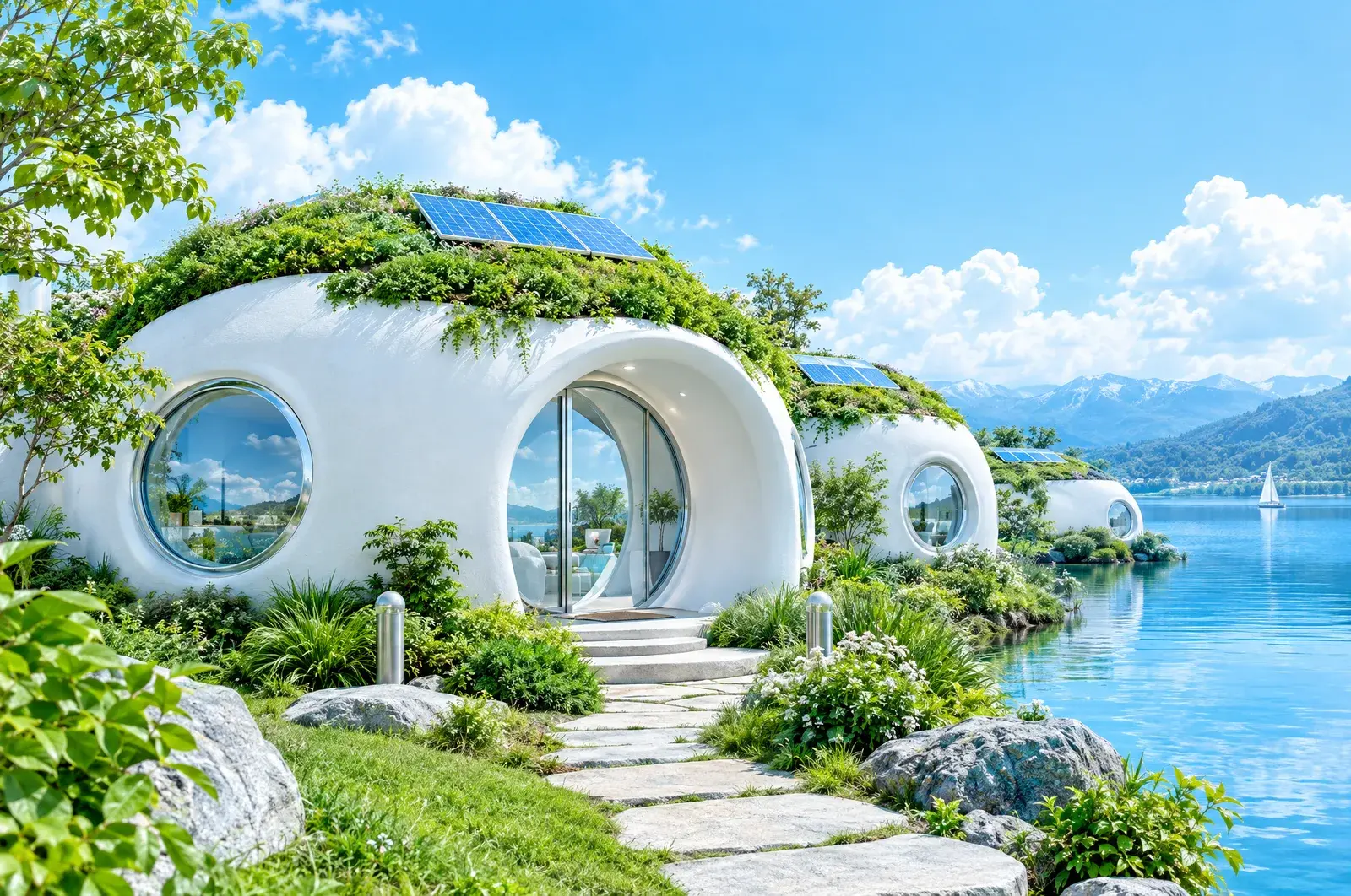 The future
Building with earth: cob, rammed earth, hempcrete and the Brighton Earthship
Around a third of the world's people live in homes made partly or wholly of earth. Here is how earth building works, what it is good and bad at, what the UK's first Earthship shows, and where it fits in a modern home.
5 min read